
Situational Awareness with a Geo-Visualization Solution
Summary
I led the design of a geo-visualization interface that replaced grid-heavy data tables with an interactive, map-first experience. The solution streamlined decision-making, reduced cognitive load, and allowed enterprise workforce managers to monitor situations in real time.
The Challenge
Existing workforce management tools relied on dense tables and disconnected views:
Overwhelming data presentation — large grids made it hard to find relevant information quickly.
Scattered workflows — related information was spread across multiple screens.
Limited discoverability — critical data points were buried in filters and menus, slowing response time.
This led to inefficiencies, slower situational response, and increased training needs for new users.
Approach
1. Research & Problem Definition
Interviewed current users to understand how they navigated and interpreted large-scale operational data.
Mapped pain points across the most common “jobs-to-be-done” (monitor situations, locate people, manage logistics).
2. Design Principles
Established principles to guide the solution:
Inspire User Confidence — intuitive, familiar interactions.
Highlight Clear Data Points — reduce noise, surface what matters.
Ensure High Discoverability — no critical information hidden in deep menus.
3. Map-First Experience Design
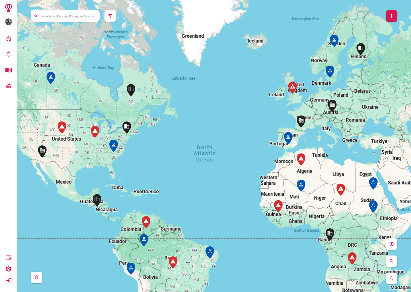
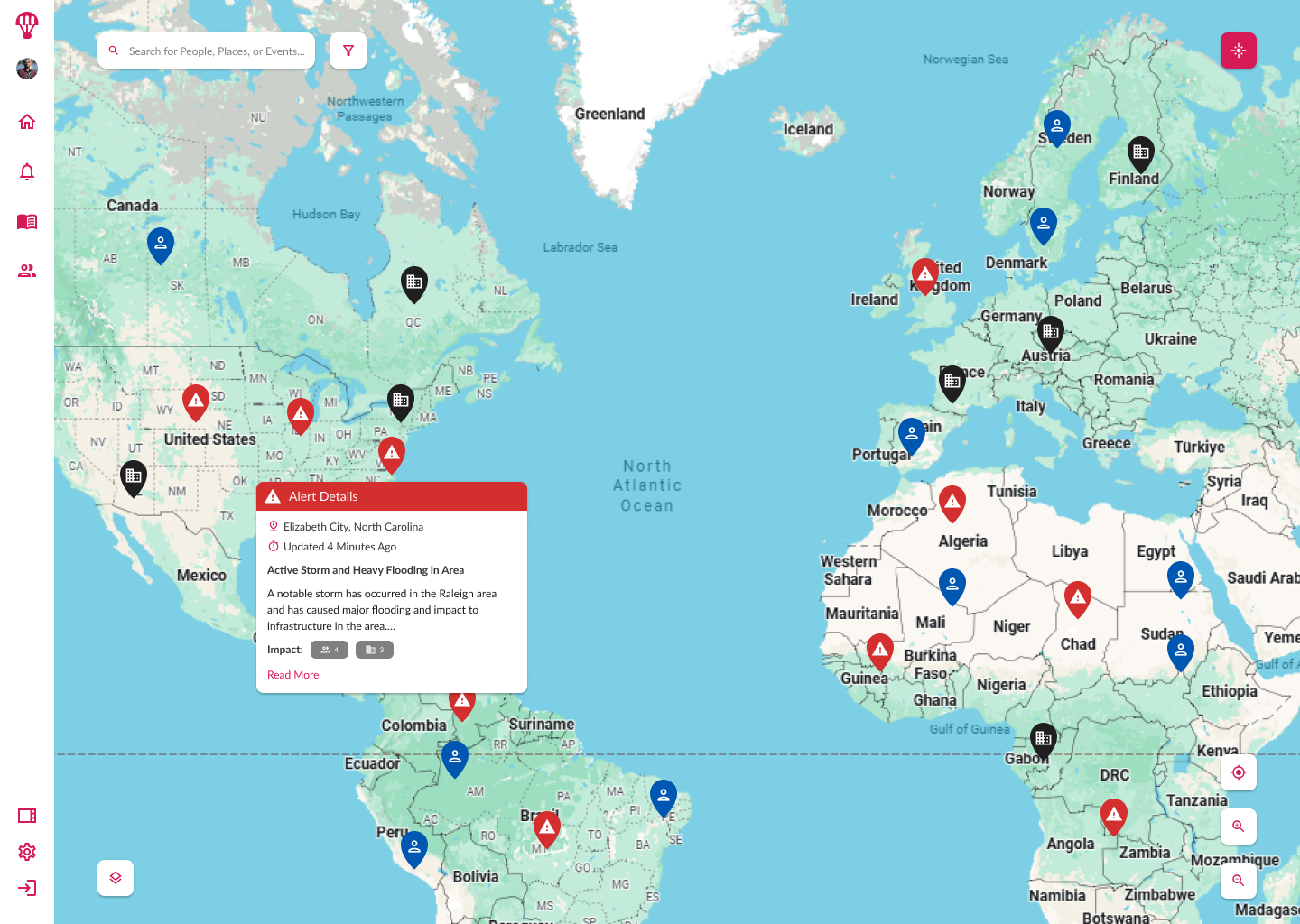
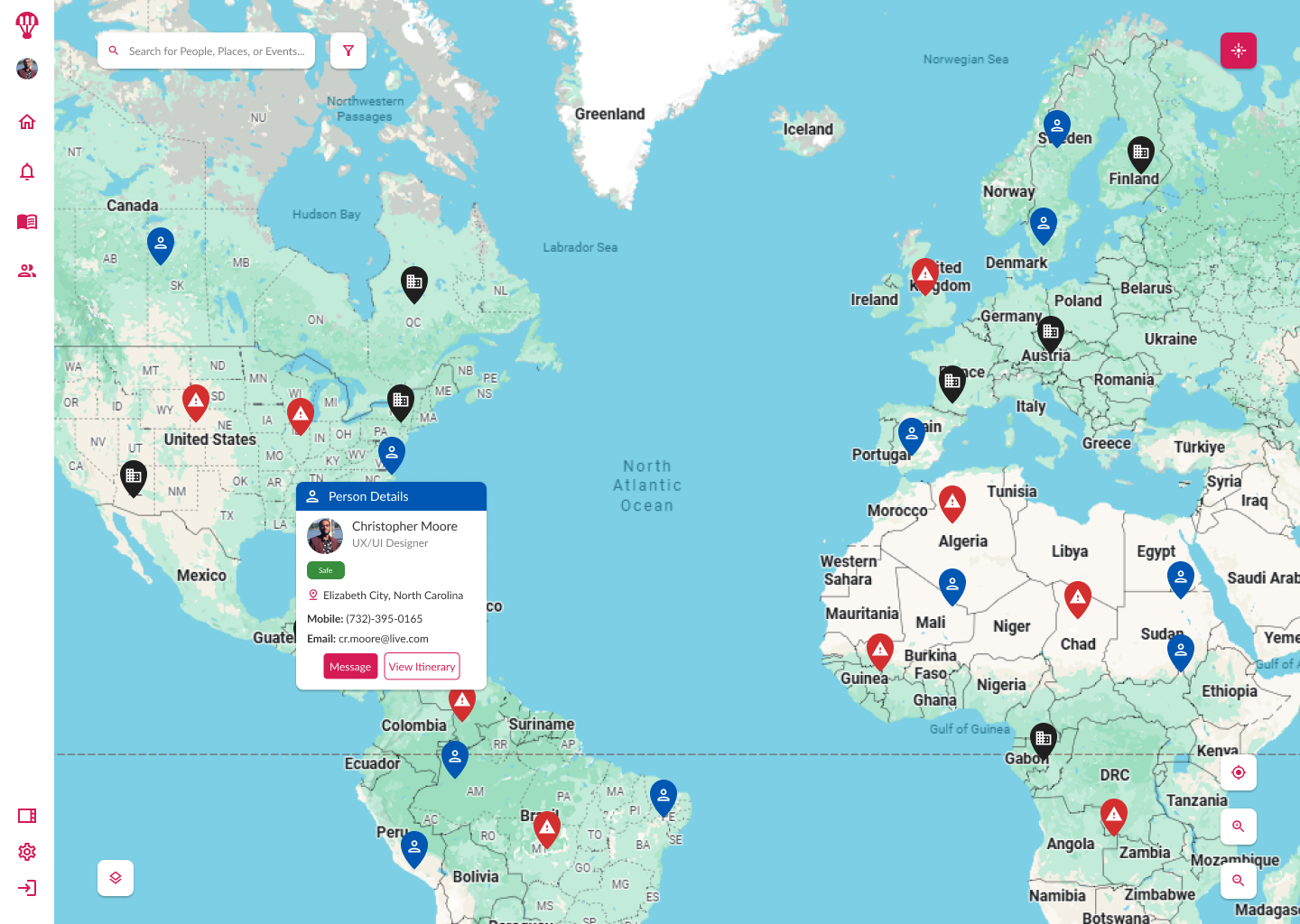
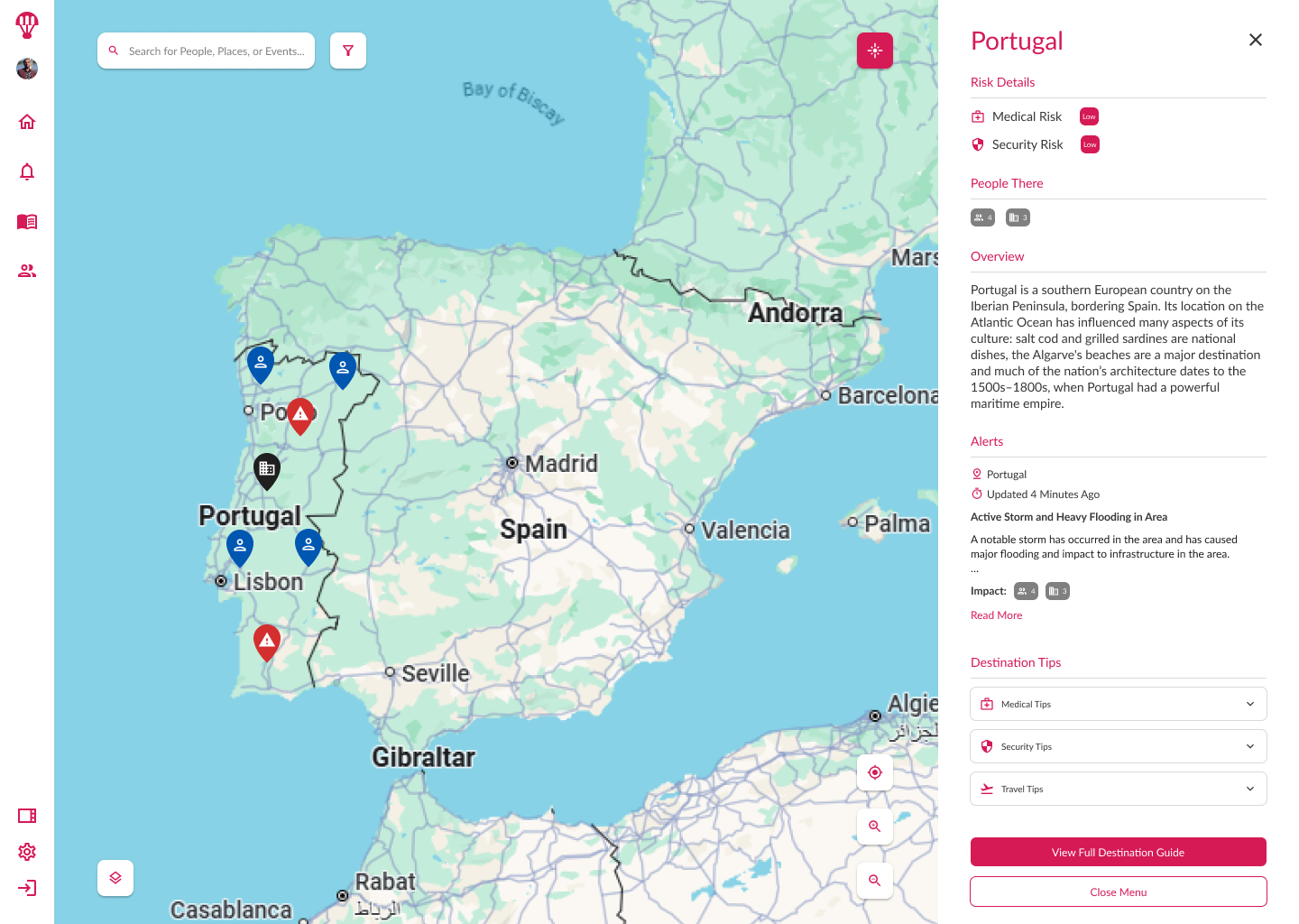
Anchored the interface around a central interactive map as the primary control surface.
Designed map layers and visual markers for ongoing situations, personnel locations, and logistics (sites, assets).
Integrated real-time alerts and contextual actions directly into the map to remove unnecessary navigation steps.
4. Personalization & Flexibility
Enabled saved filters, custom views, and settings for quick recall of frequent workflows.
Provided scalable component architecture to support future data sources and visualization types.
5. Collaboration & Validation
Partnered with engineering to define performance requirements for rendering high-density data points without lag.
Conducted prototype testing with representative users, refining marker design, clustering behavior, and interaction patterns based on feedback.
Impact Highlights
- Validated product concept through usability testing and stakeholder demos, achieving alignment across product, engineering, and leadership on the solution’s viability.
- Introduced new data exploration workflows that reduced decision-making time in pilot testing scenarios.
- Designed a scalable mapping framework to support both real-time monitoring and historical analysis, enabling adaptability for future client requirements.
- Created a modular interface that allowed engineering to integrate additional data sources without significant rework.
- Delivered high-fidelity prototypes that accelerated development readiness and secured continued investment in the project.
- Documented user interaction patterns that became reference standards for other visualization tools in the product suite.
Wrap Up
By replacing fragmented data tables with a unified, map-first interface, the geo-visualization tool improved response speed, reduced training time, and laid the groundwork for scalable, real-time situational awareness across the enterprise.
You can see the Geo-Viz designs in action in Figma.