Harmonizing Digital Experiences with a Design System
Summary
As the design lead, I audited fragmented UI patterns across multiple products and established a scalable, WCAG 2.2 AA–compliant design system. This unified the product suite’s visual language, improved usability, and reduced design-to-development handoff time.
Why this Mattered
Across the product ecosystem, users struggled with:
Inconsistent patterns — interactions varied by product, increasing learning time.
Outdated visual language — elements lacked modern accessibility and responsiveness.
Over-engineered components — redundant variations slowed design and build.
Increased Development and QA costs — Having to create bespoke solutions constantly raised internal costs for development and testing efforts.
For teams, this meant slower delivery, inconsistent quality, and ongoing “one-off” design work. In addition, the risk of further inconsistency drastically started to increase as new features and products were introduced.
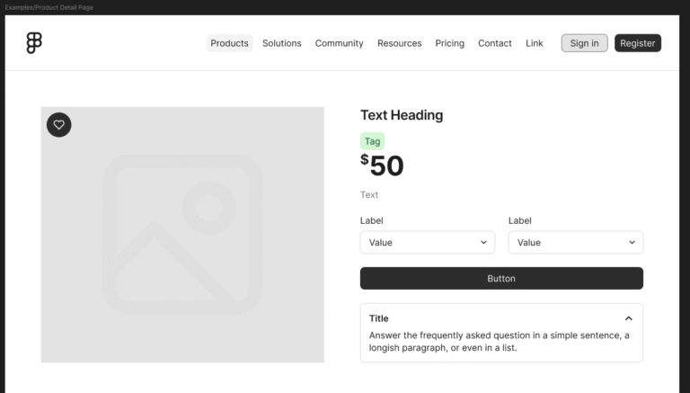
An example of how a Design System builds an interface, using different components that provide consistency and visual cues. Sample is from "Figma's Simple Design System".
Shaping the Experience
1. Audit & Definition
Conducted a full component audit across products, mapping patterns to the end-to-end user journey.
Identified and eliminated redundant components, creating a single source of truth.
Established design pillars to guide the system: interface familiarity, consistency, and accessibility.
2. Atomic Design Methodology
Structured components into ions, atoms, molecules, and organisms for clarity and scalability.
Defined standards for color, typography, iconography, and interaction states — with light/dark mode support.
3. Accessibility & Responsiveness
Applied WCAG 2.2 AA standards across color contrast, interaction states, and component behaviors.
Defined responsive grids and device-specific gestures to ensure parity across desktop, tablet, and mobile.
4. Developer Collaboration
Partnered with engineering to integrate design tokens and system components into the codebase.
Reduced ambiguity in handoff with Figma libraries, detailed documentation, and usage guidelines.
5. Prototyping & Validation
Created clickable prototypes demonstrating component use in real workflows (e.g., adding users, editing data grids).
Shared prototypes with design, product, and engineering for feedback, iterating to address technical and usability concerns.
The Impact This Had
Adoption: Rolled out system to 4+ product teams within the first quarter.
Efficiency: Cut average design-to-development time by ~75% by reducing ad-hoc design requests.
Consistency: Increased UI pattern reuse across products by over 100%.
Scalability: Enabled faster feature launches with minimal rework.
Wrap Up
The design system became the foundation for consistent, scalable, and accessible experiences across the digital suite. By pairing a strong visual identity with reusable, coded components, the system improved user confidence, reduced technical debt, and set a sustainable path for future product growth.